Sharper
Designing Classic Writing Tools Through Pattern-Driven Branding
Project Overview
Branding for Sharper ✏️
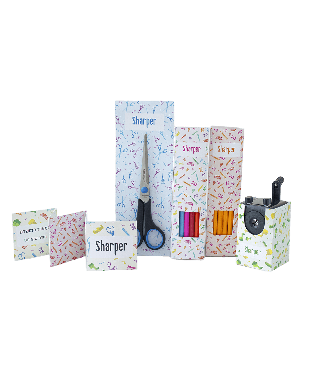
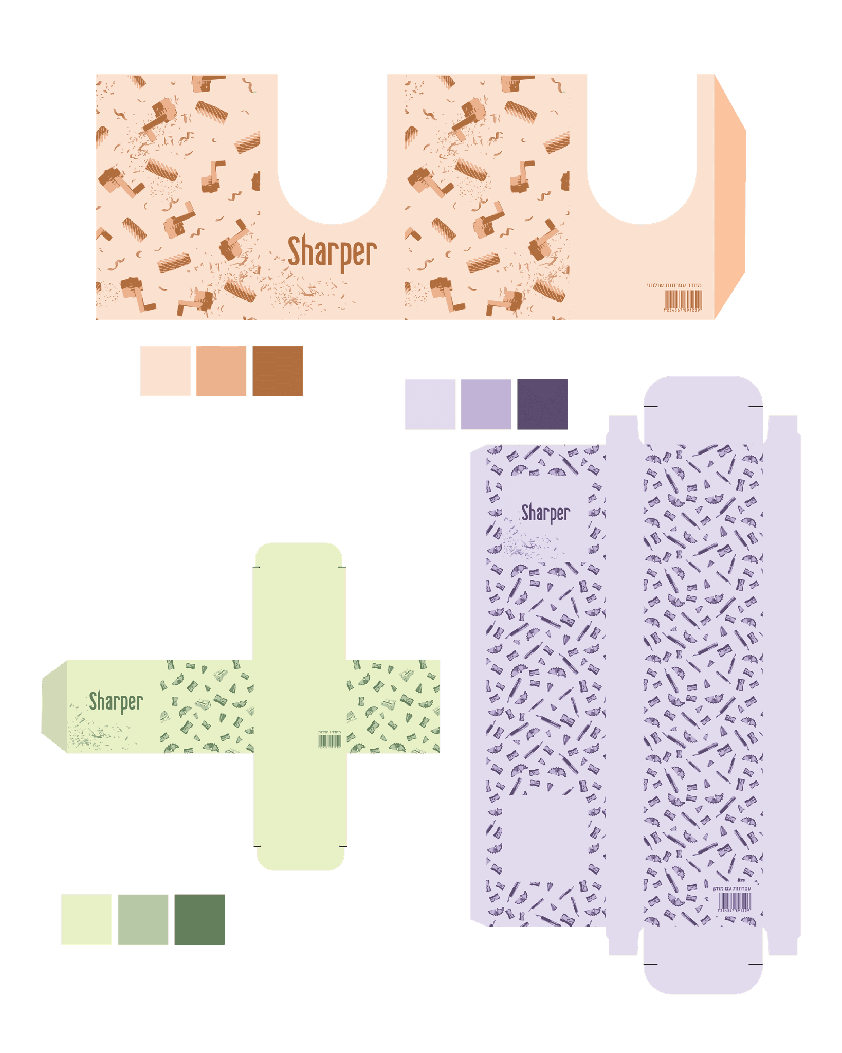
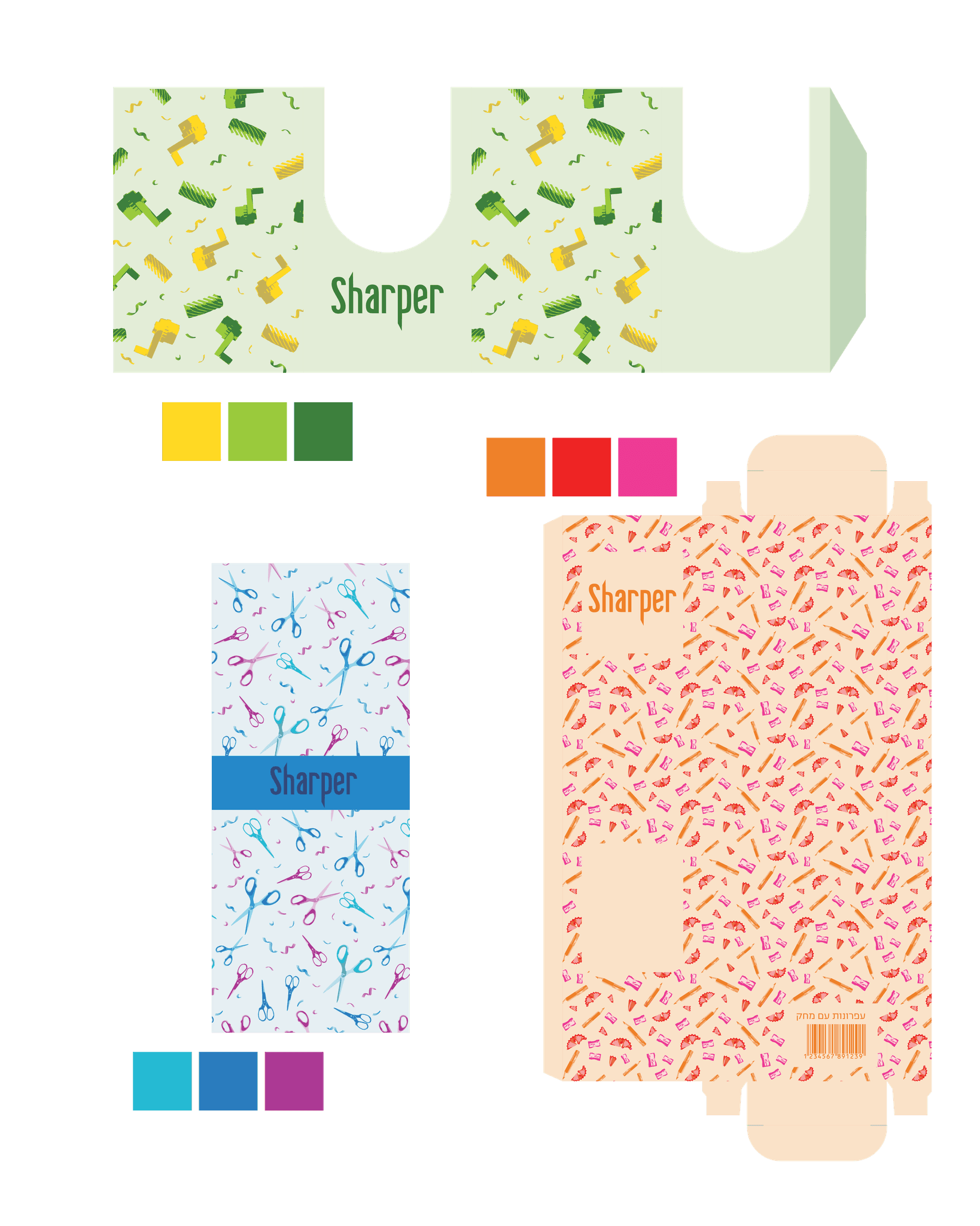
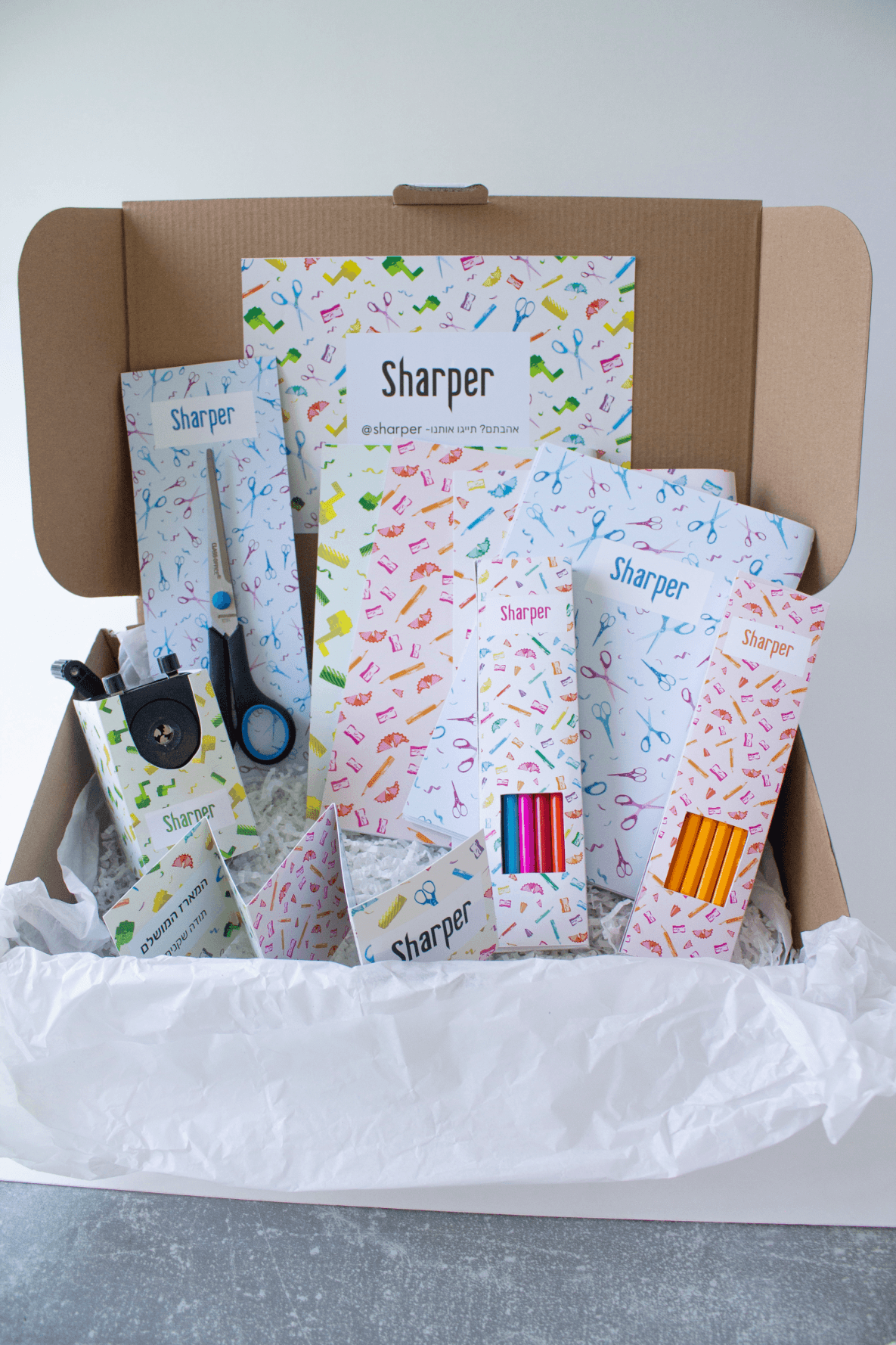
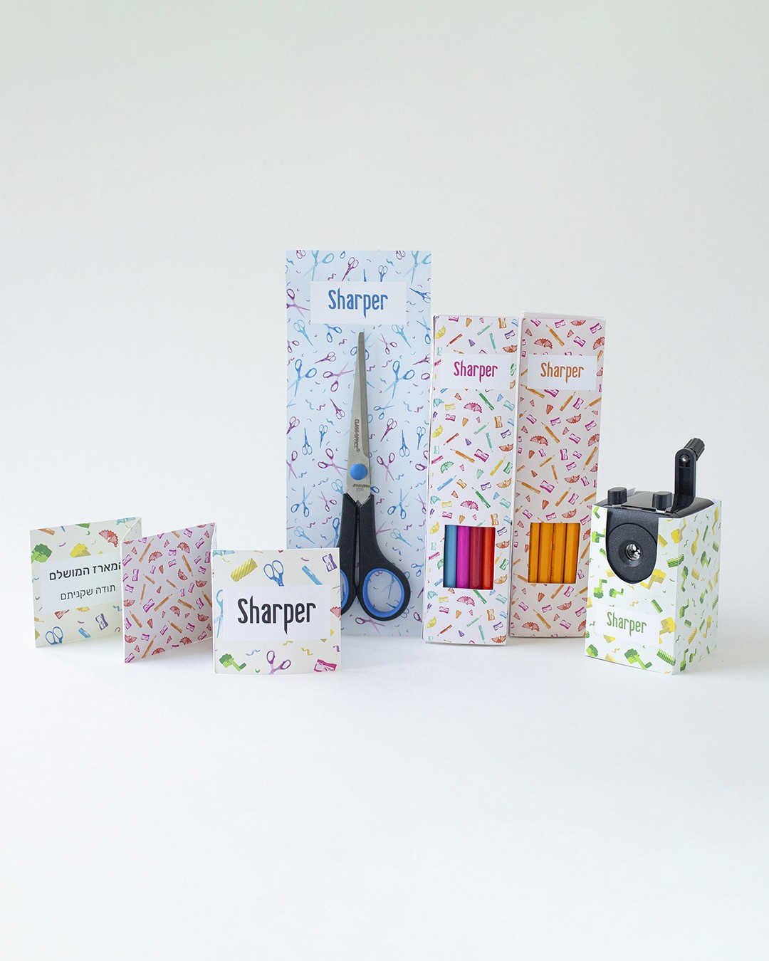
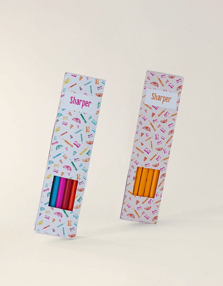
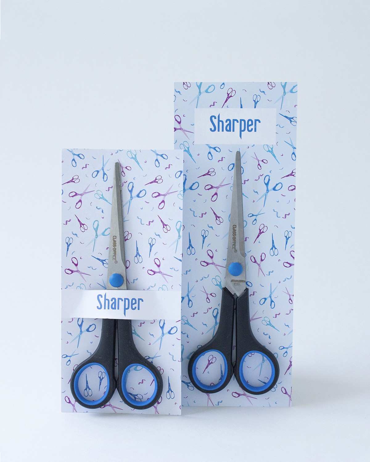
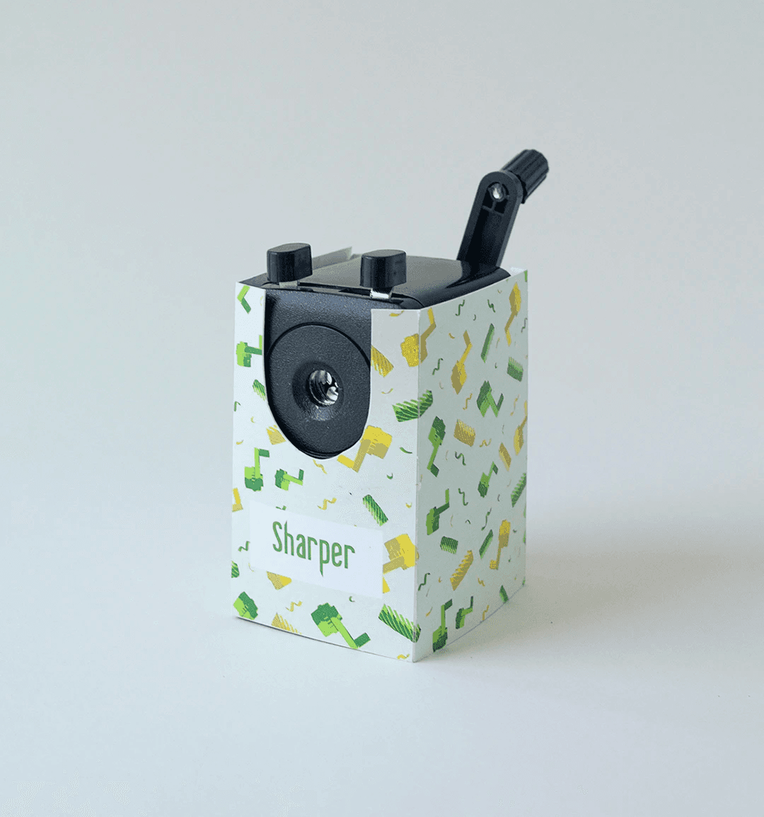
In this project, I developed a comprehensive visual identity for Sharper, a conceptual stationery brand. The core of the branding strategy revolves around creating distinctive patterns for each writing tool, where every pattern uniquely reflects the product's form and purpose. Each item received a custom packaging design resulting in a cohesive yet individually tailored brand experience.
Process
Developing Visual Patterns Through Product Analysis ✍🏼
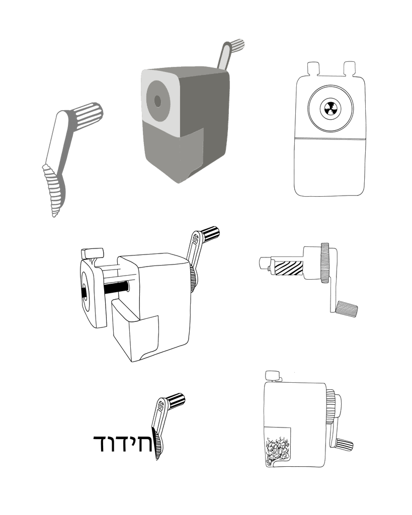
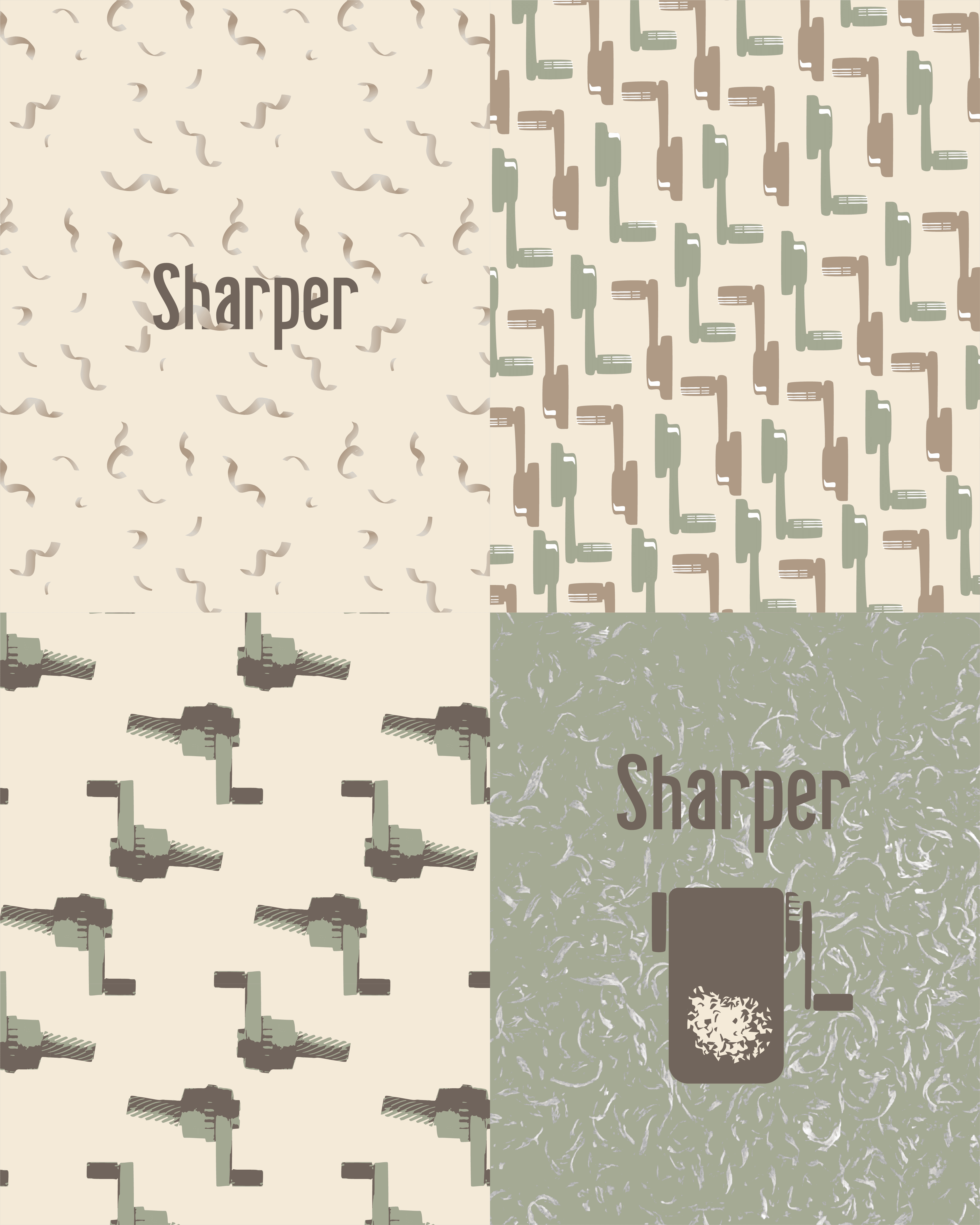
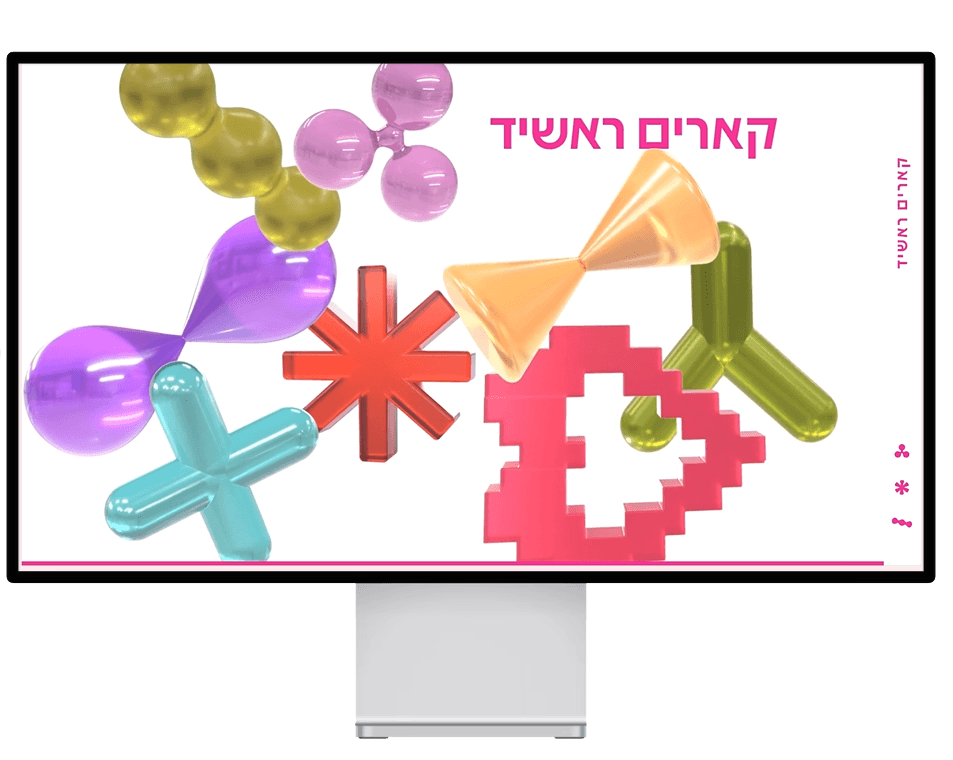
The design process focused on translating each writing tool's unique form into a distinctive pattern. Through careful analysis of shapes and structures, each pattern was developed to reflect the product's visual characteristics. The color palette was then refined to create a unified brand identity.
